Something as easily dismissible as typography is a topic that is often overlooked in the arts industry. In reality, it is one of the most vital aspects when it comes to the design process. In its barest form, design is the purpose, communicated message and theme behind a tangible piece and typography can contribute to any of these aspects through its blunt method of conveyance. As street art is generally focused around creative and critical social commentary, typography is often the best and easiest way to drive one’s point home in a meaningful way.

In this case, it is used to make the weight of the message immediately noticeable. (Created by Sean Hart, image taken from rebloggy)
While the modern perception and usage of typography has become solely based around what is saved in one’s font folder, in the sense of street art, the idea is brought back to the far older concept of calligraphy. An aspiring artist would be designing their own text rather than picking a style and typing it out, which allows for a lot more creative expression.

Variation in text inherently allows for much more emphasis than conventional typography. (Image taken from ripovisuals, creator anonymous)
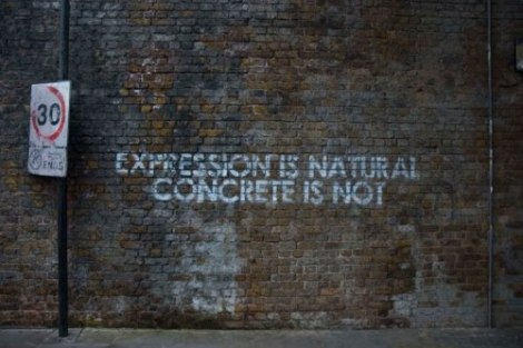
Contrary to a standard typeface, where order of layout and consistency of lettering are held in high regard, in street art, it is the variations and irregularities between characters that add value to a piece. Certain parts may be warped or emphasized to alter the theming to the artist’s taste and give complete control over how the text is displayed. This gives the message a more natural, organic feel to it that could not be replicated with any technological typeface short of outright designing one’s own font. Conversely, certain artists with high degrees of skill will take it upon themselves to utilize consistent appearing text when it can be aesthetically necessary for the content of the piece. When this sort of technique is used, it is no longer meant to represent the personality of the artist, but rather serve as a societal commentary to provide anyone an entry point to your message.

Here, the artist is directly addressing all potential viewers rather than showcasing their own artistic flair. (Created by Mobstr, image taken from globalstreetart)
Many beginner street artists will actually focus purely on typographical art to start, primarily seen through the common graffiti tag. While this is usually seen as little more than a unique signature, it still reflects the taste and some measure of the personality of the artist as they are fleshing out their drawing and design skills, and provides insight into how their style will evolve. Over time, they will no longer be just attaching their name to objects, but able to communicate their message to the wide audience street art allows for in a meaningful and insightful way.

What starts as simplistic and barren can, with time and practice, gradually evolve into something vibrant and colourful. (Created by Risk, images taken from abduzeedo and moxymag)
It may look like I am focusing too heavily on a minute part of the design process, but typography can go far deeper than what has been brought to light here. It plays as much of a role in art as colour and illustration, and in recent times has been given far more consideration in the world of graphic design. While text can look simplistic at first glance, said simplicity (or lack thereof) lends to complementing the overarching message of a piece in a straight-forward and practical way, which is perfect for accessibly conveying to the broad range of people who view street art. Overall, it is valuable for aspiring artists to understand the fundamentals and principles of typography so they may be able to better tell a story through their art.
By Tom Ovens
